


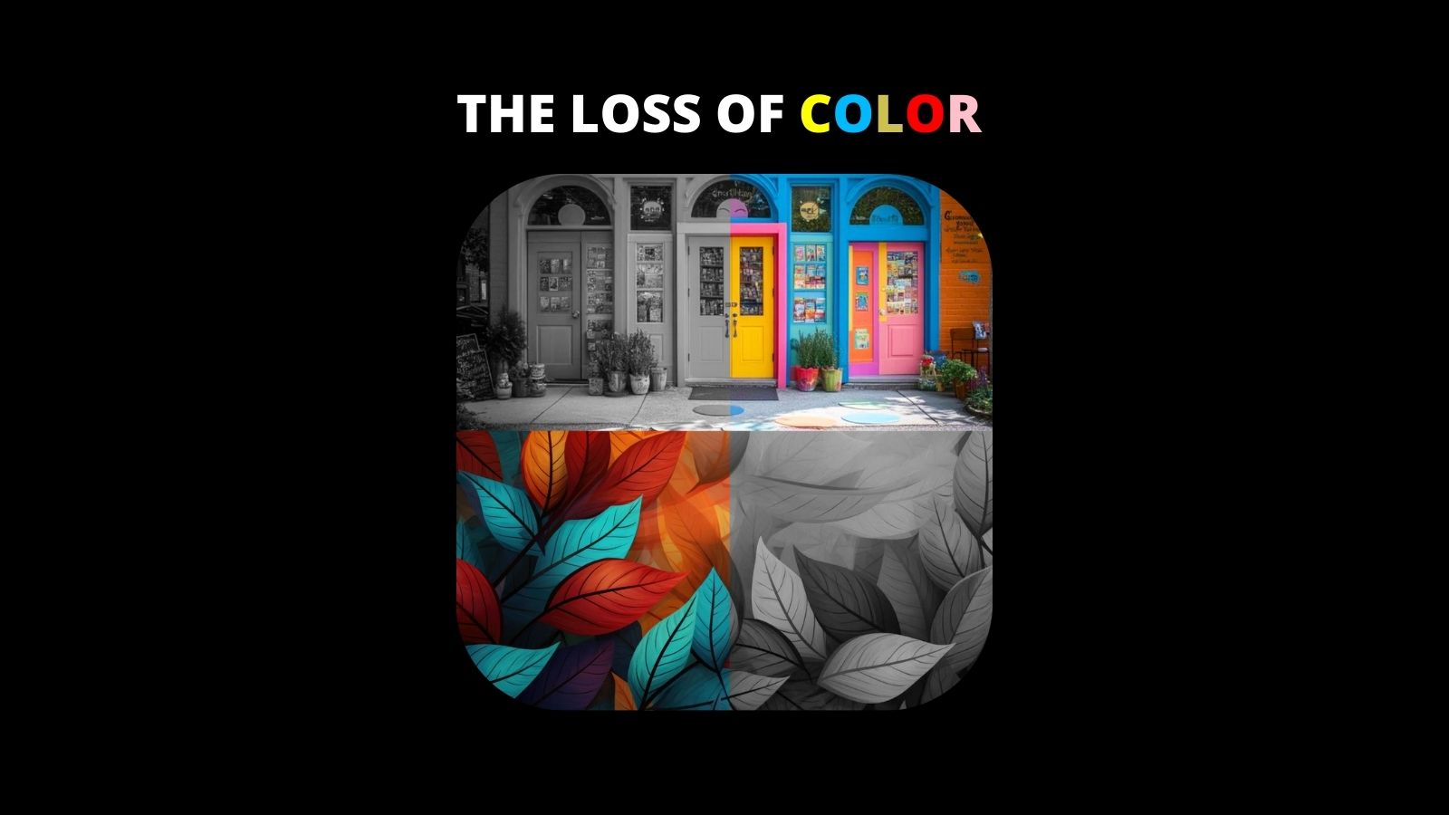
I have a secret that I only reveal when I need to: I’m colorblind. Before you wonder what kind, I’ll tell you — I do not see only in black and white (so very few people do). I have what’s known as “anomalous trichromacy.” I have great difficulty with greens. Blue and purple interchange so often to me they may as well be the same color. Orange is a constant trickster. I cannot easily identify colors unless they’re very much the definitive colorwheel version, and even then it’s 50/50 at best. As a creative person who often works on and runs creative projects, I keep this fact about myself quiet. I rely on a trusted team that knows this to work with me to bring forth the best result with color shades, tones, temps, and pairing. I’m fully capable of seeing some vibrant shades, but not all the time. It’s a very weird, very irksome disability. If you’ve seen any of my photography, it may not come as a surprise that I prefer to shoot in black and white so I can focus on the subject, the lighting, and the composition more.
What’s this all have to do with you? Well, I preface this fact about myself because I want to be very honest about what we’re seeing — while I may be colorblind, even I can tell that the world seems to be losing its color. Home design and decor, marketing, and especially film and television. Many of you may have noticed this trend, so what, if anything, is behind it?
Both on and off screen, muted tones have become increasingly dominant. You’ve likely noticed it yourself; washed-out palettes, grayscale aesthetics, and an overall trend toward neutrality. One striking recent example is Ridley Scott’s film Napoleon, where the vibrant colors of the costumes and sets were muted to grayish-blue tones during post-production, leaving audiences wondering why the visuals seemed devoid of life. Since the Dark Knight trilogy, films have aimed to become “grittier”, a trend that’s continuing, but is also now starting to see some push-back from viewers. Even the branding of studios and streamers is following suit; MAX — formerly HBO Max — is changing its iconic blue and white logo colors to a stark black and white.
The association of "gritty" with muted tones stems largely from cinematic tradition and cultural conditioning rather than any inherent quality of the colors themselves. Classic crime dramas, neo-noir films, and war movies like Se7en, The Dark Knight, and Saving Private Ryan, all used muted, desaturated color grading to emphasize realism, danger, and hardship. This established a visual shorthand where gritty stories naturally became linked with gritty colors. Older film stock and documentary footage often had washed-out, muted hues, reinforcing the idea that such tones convey authenticity and grounded storytelling.
Psychologically, muted colors feel more raw and unfiltered, while vibrant colors feel heightened or fantastical; a contrast that shapes our expectations when it comes to dark or realistic narratives. However, this convention isn’t set in stone, and some filmmakers have successfully combined vibrancy with grit to create unique and jarring experiences. Thankfully, films like Spring Breakers (2012) and Drive (2011) use neon and synthwave aesthetics to tell dark, violent stories, challenging the norm and using bright colors to create a sense of discomfort or irony. This contrast can be powerful and unsettling, highlighting the clash between playful visuals and dark subject matter. While muted tones remain the dominant choice for gritty stories, these exceptions demonstrate that it’s possible to convey grit through color, it just takes a more deliberate and thoughtful approach to storytelling. But why is this happening, and what’s driving it? Well, basically, we keep paying for it, telling studios we want it; voting with our wallets, if you will. Take a look at the image below of Zack Snyder's Superman. If you can believe it, this is a comic book character once associated with bright, vibrant blues, reds and yellows.

Take it from me, color is a far more complicated topic than most people ever consider, and one we constantly take for granted. Color is rooted not just in visuals, but in culture, folklore, and, most importantly for this conversation, language. Color and language are inexorably linked. The primary example I can point to right now? The color pink. (Which I often confuse with gray — admit it, you’re still wondering what it's like to be colorblind!)
Pink was only very recently associated with feminine qualities. The transformation of pink from a masculine to a feminine color is a fascinating story shaped by shifting cultural norms and marketing strategies. In the 18th century, pink was seen as a masculine color in Europe, particularly among the wealthy aristocracy. As a lighter version of red — which symbolized power, passion, and war — pink was considered bold and strong. Meanwhile, in Western cultures, blue was simultaneously associated with the Virgin Mary, and symbolized purity and serenity, with many deeming it more suitable for girls. In the early 1900s, pink and blue were not associated with specific genders, and both colors were used interchangeably in design. An article from the trade publication Earnshaw’s Infants’ Department in 1918 even stated that pink was generally accepted for boys because it was “stronger and more decided,” while blue was seen as “delicate and dainty” for girls… (We’ve been painting baby bedrooms all wrong, friends!)
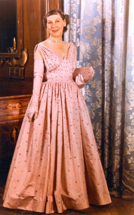
And then, as is often the story of the world with these kinds of things, World War II happened, and after it came to an end societal norms and commercial interests began to solidify color associations. The rise of mass marketing and consumer culture in the 1940s and 1950s led manufacturers and retailers to color-code baby clothes, with pink gradually becoming associated with femininity due to aggressive marketing strategies. A pivotal moment came when First Lady Mamie Eisenhower wore a pink inaugural gown in 1953, making the color fashionable and elegant for women, and make no mistake, elegance was both form and function here, so the occasion overtook the color’s previous connotations, and a new trend was born. If Dwight had worn a pink tie, maybe we’d be having a different conversation now. By the 1960s and 1970s, as the women’s liberation movement challenged traditional gender norms, pink became increasingly linked with traditional femininity, which some feminists pushed back against. By the 1980s, with gendered marketing becoming more pronounced, pink had become fully entrenched as a "girls’ color" due to continued targeted advertising and cultural reinforcement.
The change from pink as a masculine color to a feminine one wasn’t natural or inevitable at all, but rather driven by commercial interests and social engineering — both intentional and unintentional. Companies saw opportunities to market more products by differentiating genders, encouraging parents to buy separate clothing and toys for boys and girls. In recent years, however, there has been a push to reclaim pink as an empowering, gender-neutral color, as seen in movements like Pink Shirt Day (anti-bullying) or #BoysWearPink campaigns. This shift highlights how cultural perceptions can be shaped and reshaped by social norms, consumerism, and marketing strategies.
The trend toward muted tones is not just a modern aesthetic choice but really has roots deep within Western thought. According to David Batchelor’s book Chromophobia, this phenomenon can be traced back to the birth of Western philosophy. Plato and Aristotle set the stage by associating color with sensory chaos and form with intellectual order. Plato famously saw the sensory world as deceptive — a “prison-house” of illusions, while Aristotle believed that form and line, rather than color, carried the soul and meaning of an image. Later philosophers, like Kand and Rousseau, echoed this sentiment, suggesting that while color can add charm, it has no bearing on true aesthetic judgment because it merely stimulates the senses. Personally I’d like to have a drink with these men after taking them through a modern art exhibit. In this context, color became associated with irrationality and distraction, while grayscale and form signified rationality and truth. I do tend to lean towards some of this thinking in my own black and white photography; often focusing on the emotion and action in a picture, rather than its trappings.
This mindset has permeated not just art but architecture and design. During the rise of modernism, minimalism distilled forms to their bare essentials, stripping away color and detail in favor of pure structure. The result? A “copy/paste” world of colorless architecture, buildings that look the same whether they’re in Boston or Beijing. The trend can extend to branding as well. Brands that want to appear serious and sophisticated often opt for muted storefronts and achromatic aesthetics, unlike more colorful spaces like bookshops or plant stores.

In the realm of film and television, muted tones have gained popularity as a way to evoke realism, melancholy, or introspection. Prestige shows like The Last of Us, Ozark, and The Crown use these palettes to immerse audiences in a world that feels raw and authentic, rather than glossy or overly stylized. Directors like David Fincher and Denis Villeneuve have championed this look, blending muted palettes with monochromatic cinematography to enhance mood and tension. The aesthetic also takes cues from Nordic noir and European arthouse cinema, where muted tones have long been favored for their introspective and somber qualities — head on over to Mubi.com, search those terms and see what I mean here.
The rise of prestige TV and streaming platforms has also played a major role in the muted color trend. Shows that aim to look like high-quality films often adopt muted, desaturated palettes to signal seriousness and depth. Additionally, streaming services frequently compress video files to save bandwidth, which can lead to color banding and visual artifacts. Using muted tones and subtle gradients helps minimize these issues and create a more consistent visual experience across devices.
In an age where audiences crave authenticity, bright and oversaturated colors can feel artificial or contrived. Muted tones mimic the look of natural lighting, giving dramas and grounded narratives a more relatable feel. In dystopian stories or period dramas like Chernobyl or The Queen’s Gambit, muted colors evoke a sense of nostalgia or historical realism, reminiscent of faded photographs or vintage film stock. However, the recent success and controversy of Wicked may have taken a big swing at this notion, more on that in a moment.
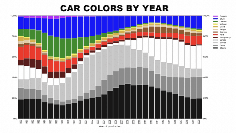
The muted trend isn’t limited to film and TV; it’s part of a larger cultural movement toward minimalism and neutrality across industries. From interior design to car colors, where 80% of new cars are now black, white, silver, or gray (source: Automotive News), the desire to appeal to the broadest possible audience has led to a shift toward neutral palettes that don’t alienate anyone. This drive to homogenize and minimize risk echoes the shift in music, where complexity and experimentation are often stripped away to create mainstream hits, rather than challenging or divisive art.
While muted tones dominate now, there’s already some pushback. Films like Barbie and The French Dispatch have embraced vibrant, dynamic colors to stand out from the sea of desaturation. And then the previously mentioned Wicked also just stepped into this particular spotlight. A recent post on social media showed the difference between the original colors of the production design vs. the color grade, and the difference was massive. The Land of Oz IS colorful, and yet, the film muted much of that. The reaction was sizable enough to bring the conversation into the mainstream with several entertainment programs pointing it out.
As audiences seemingly grow weary of monochrome worlds, there may be a shift back toward bolder, more diverse color choices that balance rationality with sensory impact. Maybe the best art, and the most resonant aesthetic, gives equal weight to form and color, balancing reason with emotion. The current grayscale obsession may one day give way to a more balanced approach, where color once again holds space as both a visual and intellectual force. Black and white imagery can be truly beautiful, but so can the bright colors of a child’s finger paint picture. Both are very serious images to the artist, but both can also be fun. So long as we’re having fun, we’ll have color… something to think about.
Filmmakers are working with the world's biggest brands on Tongal.

These are some good insights. I'd also add that different cultures view color differently, as well as with language. For instance, Russia has two different Blues.