
As part of our creative partnership with CinemaHow, the internet's home of breaking down film, the talent behind the hit Instagram channel is sharing extended analysis of some of cinema's greatest works with our Tongal community. Here, CinemaHow co-founder Jamie Wrench elaborates on our recent collaborative reels diving into the color theory of Up and the LEGO movie franchise
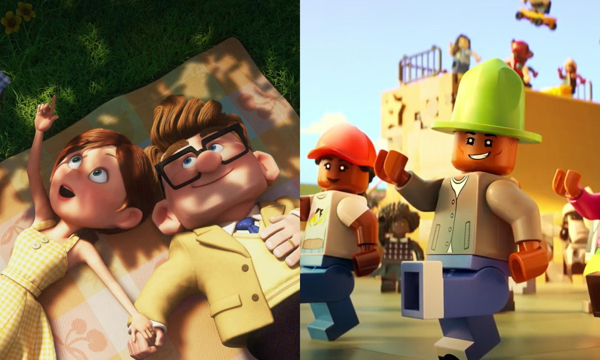
At their best, Pixar’s genius largely lies in their films’ ability communicate key themes through just their stunning visuals alone. 2009’s Up contains perhaps the most effective example of this, opening with an infamously tear-jerking montage of Carl and Ellie’s life together, communicating Carl’s grief of losing Ellie in an entirely dialogue-free sequence. Though the themes alone are tragic enough, a large part of what makes this opening so effective for me is the subtle application of color theory throughout by the filmmakers.
From the moment they paint their names on their letterbox, Carl is assigned a yellow-green color, whilst Ellie is a warmer pink-purple tone, with the early scenes of the montage bathed in an equal share of the two colors. Yet, as her presence fades from his life, the colors assigned to her vanish from his surroundings, and his own associated colors become desaturated, almost sickly, a subtle visual reflection of his own grief and emptiness. It’s only as he pursues, and eventually accomplishes, their shared dream that the pink-purple tones return, ultimately guiding us through his character arc with subtle color theory.
Its details such as this that, for me, attribute massively to the Pixar’s reputation as a powerhouse in animation, particularly throughout the 2000s. In the case of Up, co-directors, and animation legends in their own right, Pete Docter and Bob Peterson’s genius attention to detail created a level of depth to their narrative that transcends the expectations of a children’s movie, instead offering something emotionally powerful for all demographics.
The LEGO Movie, released in 2014, exploded the brand's on-screen popularity, creating the path for four more feature films over the following years — most recently Pharrell Williams' biopic Piece by Piece, co-produced by Tongal, which is my personal favorite of them all. Praised greatly for both their precise attention to detail and their accessible-to-all-ages style of humor, LEGO have truly cemented themselves as a pillar of animation in recent years. Taking a closer look at the visuals across their films, the animators have cleverly tackled the challenge of presenting thousands of LEGO pieces on-screen at once, partly through the instinctive adherence to a classic convention of design and color theory.
The 60-30-10 “rule” is a guideline for visual harmony across many creative mediums, generally considered to have its roots in interior design. In film, the guideline outlines that roughly 60% of the frame is made up of a foundational color, with 30% being a secondary tone, leaving a final 10% accent, usually the subject of the frame, that naturally guides our eyes. Across the LEGO film franchise, instinctive applications of this guideline can be found throughout, often grounding the controlled chaos of the films in a visually digestible manner.