

Sometimes bad typography happens to good people. The average computer comes with 100 or more fonts installed. That doesn't mean you have to use them all at once. Typography is an ancient art with more than 500 years of history and tradition behind it. Some of those traditions are archaic and unreasonable to modern sensibilities. But plenty of them are just as valid as they were that day in 1450 when Johannes Gutenberg printed his very first book. Early film and television credits meant complicated processes that involved painting on glass or long rolls of paper that were superimposed on-screen using optical printers (for film) or via electronic means (for video). The limitations of these methods imposed a degree of discipline that went out the window with the first eighth-grader who used MS Paint to promote the annual bake sale with Comic Sans and a font shaped like balloon animals.
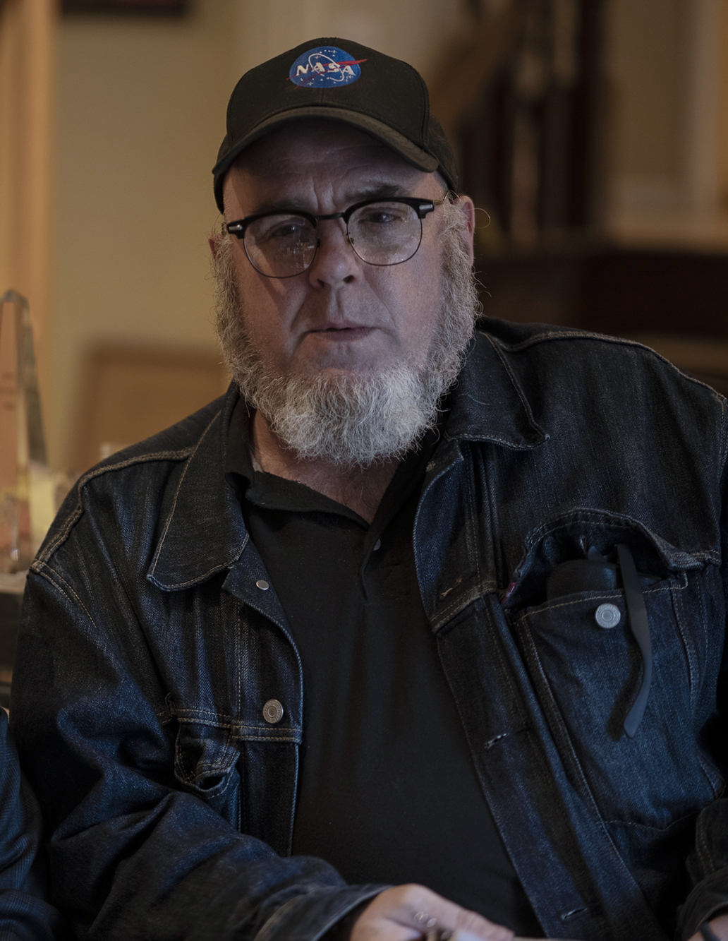
Designer Aaron Draplin's client roster includes everyone from a cherished local hot dog vendor to the United States Postal Service. Draplin says "Good typography is just as important as F-stops, lighting and editing, but often gets the shitty end of the celluloid.”
Below are some samples of Draplin's work including his snazzy Star Ribbon stamp for the USPS, a poster for comedian Marc Maron and an example of his wildly successful FIELD NOTES line of simple and practical pocket notebooks. You can get a free test drive of his DDC Hardware font here.
Draplin's book “Draplin Design Co.: Pretty Much Everything” is filled with mighty fine examples of type design that are deceptively simple, but pack a lifetime of tradition and thought into every choice he makes.
Check out Draplin's video “Working Efficiently in Illustrator with Free Vectors”. Even if Adobe Illustrator is not your cup of tea, Draplin effortlessly navigating a sea of digital choices is like watching a Tibetan monk creating a sand painting. He makes it look easy.
You don't have to be a design wizard to create something spellbinding. (The magic has been inside you all along!) Here are five simple things to make sure your on-screen type does what it is supposed to do.
1. Size Matters!
Having spent 30 years as an art director at The New York Times, Steven Heller knows something about putting letters where they belong. “The one thing I hate about film typography is when the end credits are too small for the screen...” he told us. “I know it was not designed for TV, but increasingly, TV is the movies. So make it responsive to different media platforms, or else!”
Online text and interface elements can be designed to adjust dynamically to the device they are being viewed on. The social media site you are posting on will scale and align to (hopefully) make your work legible and appropriate to the screen it ends up on.
But if you are delivering video, you have to choose wisely as your text will be hard-wired into the screen. Video has been inching away from the legacy aspect ratios of widescreen film and television formats and towards the vertical look embraced by TikTok and Instagram. This can wreak havoc with your thoughtfully designed text blocks.
A CNN screen filled with scrolling tickers and the time and temperature in the corner looks fine on your living room LED TV, but try watching that on your mobile device at arm's length.
The “ten-foot user interface” is what you first encounter when you fire up Netflix or any on-demand service from the comfort of your sofa. As you might have guessed, it is designed to be seen from across the room with a minimum of fuss on almost any big screen device. The type is large and easy to read. Large blocks of dense text are kept to a bare minimum.
Mobile video is sort of an inversion of that concept. Bold and generously sized text work to your advantage on a tiny screen. But anything more than four lines, 70-80 characters (or spaces) across is probably too much to parse.
And keep your text on screen long enough for someone to read it. A good rule of thumb is you should be able to read the text three times before moving on.
2. Location, Location, Location.
Until the implementation of digital video, broadcast television was the standard-bearer for how video was supposed to look. The television signal that broadcasters were stuck with was a cobbled-together compromise of less-than-ideal solutions designed to work with hardware that spanned 50 years of technology.
Television screens were bulbous glass tubes lit by a flickering ray gun with varying degrees of consistency. The “title safe area” was an imaginary border along the four sides of the screen. Placing any text outside the border and you risked the name of your trusted local news anchor getting chopped off or vanishing completely.
You will never complain about Photoshop again after you sample some of the bizarre (and ingenious) techniques designers used to get their point across in the dark dawn before digital images. You can see everything from scrolls of paper to elaborate mechanical gadgetry being used in the vintage 1960 clips below.
Even though digital video has eliminated the fishbowl distortions of old school screens, it's still a good practice to give your screen text breathing space. If you divide a screen into three equally-spaced horizontal zones, your text on the “lower third” should be positioned near the top of that zone. Conversely, text destined for the upper zone should sit on the lowest part of the top zone.
If you are ready to take a deep dive into the working of the prehistoric era of video graphics, click here.
3. Space is The Place.
Kerning is the horizontal space between individual letters. Leading (also known as line spacing) is the area between one line of type and the next. That old klackety-klack typewriter that Ernie Hemingway poked at between shots of rum churned out pages of text that had a fixed-width between each letter. The result was certainly legible but it lacked the nuances and subtlety found in a book or a newspaper created with all the bells and whistles available in a dedicated typesetting machine.
Take a look at an upper-case “I” and the keyboard-adjacent “O”. The “I” uses about a third of the space that the “O” needs. That ATM receipt that you tossed in the trash yesterday is a good example of mono-spaced type. It's readable but it ain't pretty.
Almost any tool you use to put text on a screen will give you granular control over the leading and kerning. A good rule of thumb is to set your leading somewhere between 125% and 150% of your type height. That means a character that is 100 pixels high will have 25 to 50 pixels of space between each line. This gives plenty of room to keep the dangling bits of lower-case letters like “y” and “g” from scraping the top of the next line.
Proper kerning can be tricky. The objective is to give the appearance of consistent spacing across your text. Too much space between letters makes it harder to read but a logo or a title screen graphic can benefit from more generous spacing. Keep dense blocks of text consistent across your project but feel free to play around with your “Directed By...” credit.
For a deeper understanding, check out designer Mark MacKay's KernType, an online kerning challenge that makes the whole process into a game.
4. Drop Shadows and Bevels.
Bevels and drop shadows are a bit of a sore spot with some designers. With a single click, most graphics programs can make your flat, ordinary type appear to float magically on the screen.
These are easily abused effects that can turn a concise image into a busy, buzzy swamp. But while these embellishments can make your website look like a 1995 Geocities page for Hootie and the Blowfish fans, they sometimes serve a more utilitarian function in video.
A subtle bit of drop shadow and beveled edges can help separate your text from the background. If you have a line of white type that appears over someone's white shirt, it's going to be hard to see.
Sure, you could change the color of the type to provide some contrast but consistency is another hallmark of good design.
5. Color Me Impressed
Another pitfall of early video was a tendency for certain colors to smear and blur. Rich, saturated colors were especially prone to this. The broadcast video signal was a weird animal. A line of white type that was too bright could actually cause audio problems, creating a strange buzz when the luminance channel jumped lanes into the audio signal.
The color depth of contemporary video is light years away from the limited palette of ye olden days. An average human can see somewhere between 7-10 million distinct colors. Only a few years ago, your computer screen had a palette that maxed out at 256 colors. Those 256 colors could be tweaked and mixed to fool your eyeballs into seeing a fairly robust image but that also took a lot of processing power away from other important tasks. This is why early incarnations of Mario and Luigi appear more like blocky LEGO figures next to the lovable, almost human plumbers we use to rescue princesses when we really should be finishing that job that's due tomorrow.
These days, even your phone screen can deliver millions of colors. Then again, just because you have access to an almost unlimited range of colors, that doesn't mean you have to throw them all at the screen.
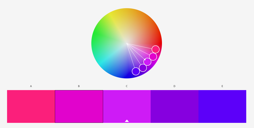
You should organize a color scheme for your project and stick to it. There are as many opinions on how to achieve this as there are colors in the rainbow but you don't have to do the grunt work alone.
Adobe Color Wheel is a free tool that lets you create a harmonious color palette without spending years in art school sloshing oil paint around a canvas.
Everybody loves to talk about how once you learn the rules you can toss them out the window. The problem is people tend to skim over the learning and rush into the tossing-out-the-window stage. Developing a personal visual style comes from how you deviate from the fundamentals in a way that works. Know the basics, but don't be afraid to experiment and push the boundaries.
Pixels are cheap. You can hit the UNDO button anytime. Go a little crazy. Use Comic Sans if it makes you feel better. (But try not to laugh when the client says his wife really likes Papyrus.)
__
Note From Tongal: "Your Video Typography Sucks (And What You Can Do About It)" is part of a series of Tongal Community-written blog posts that were originally sourced in the Tongal Blog Open Call Project. The views and opinions expressed in this article are those of the author(s) and do not necessarily reflect the official policy or position of Tongal. Read more Tongal Community-written posts here and then Pitch us a topic you'd like to write about for the Tongal Blog!