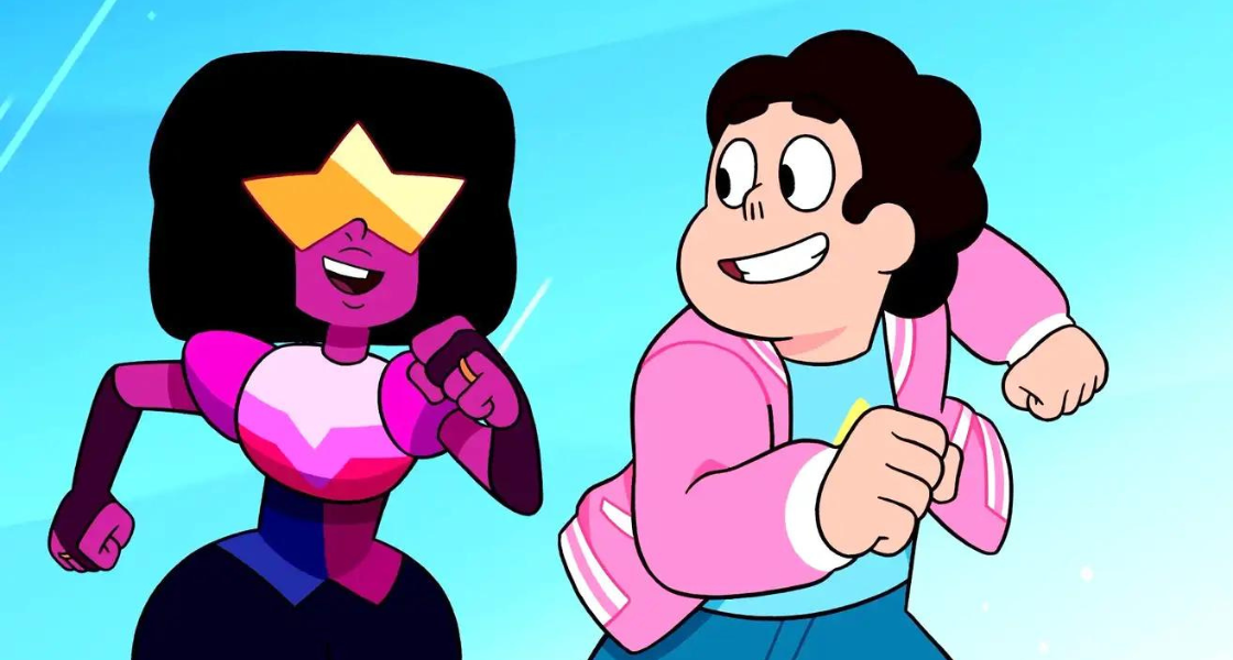
Character design plays a critical role in the creative storytelling process. It subtly implements the narrative, pushes the plot, and executes the characters' desires. A great character design hints at the character's relationship with the world around them and influences how the viewer feels about them. Thus, designing a character for animation is a huge responsibility that can be overwhelming to some. If you're wondering where to start, you're not alone.
The frequency a character appears typically determines how complex the design should be if you want to work efficiently and meet project deadlines. Drawing a character a few times for a book or trading card design is less stressful than drawing it countless times for a graphic novel or animation. Therefore, knowing what you're designing for is essential in prioritizing the design process. Character design for animation is finicky. It must match the project's aesthetic, move believably, and be drawn repeatedly without getting bored with the details–for you and your team.
When designing for animation, having several skills and post-it note tips at your disposal can streamline the process. I'll run through three main points of focus I consider while working on an animated project. This list keeps me accountable for my design choices, so I'm realistic about what's possible for me, my team, and the time I have.
How does this character's body move?
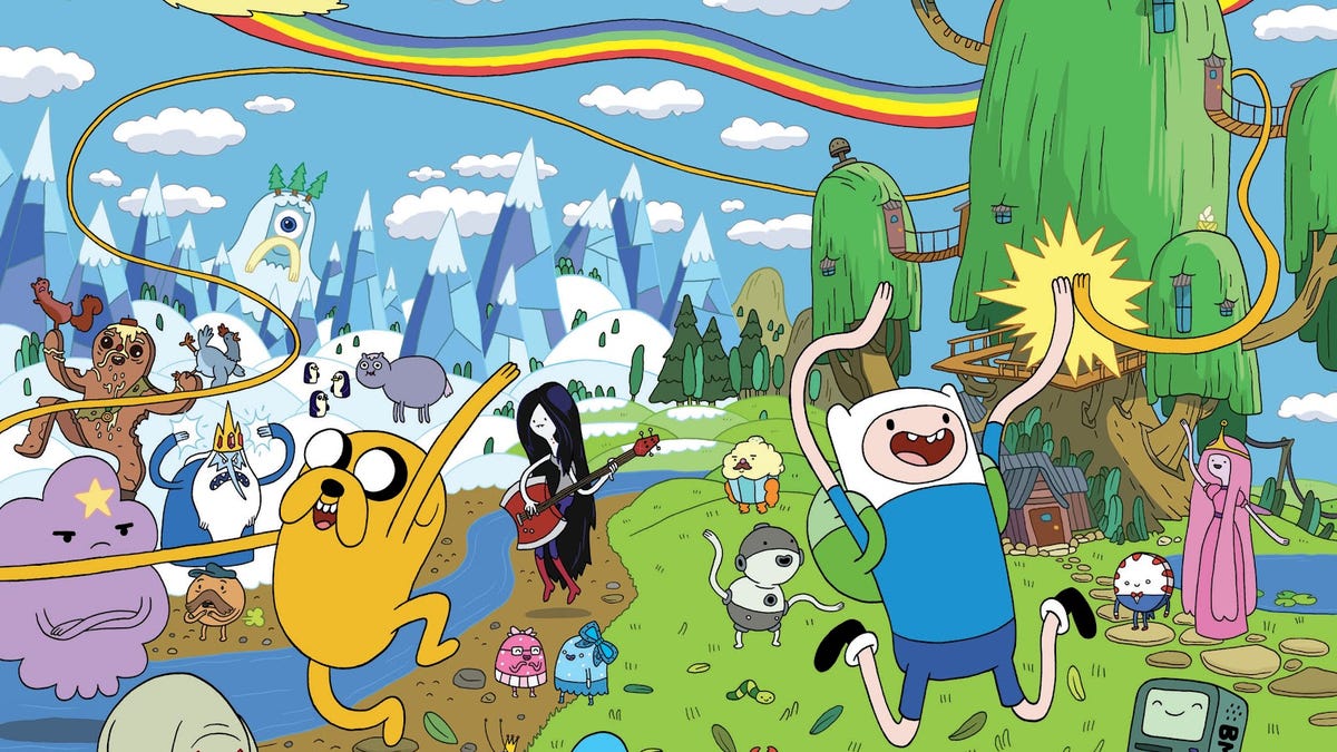
First, understanding how a character's body moves is crucial. This involves studying anatomy and creating dynamic, believable poses and expressions. For example, Mickey Mouse, created by Walt Disney and Ub Iwerks, has a simple design with a round head and body, big ears, and white gloves. However, his design allows for a wide range of expressions and emotions, making him a beloved character. When you look at Mickey Mouse, you can easily visualize the various geometric shapes that build his form due to the simplicity of his design (And, for the record, is recognizable across nearly a hundred years of iterations in 2D and 3D animation!). Artists who take the time to fully observe the underpinning of a creature, human or animal, begin to see the broken down construction that makes us. Understanding the body gives you the ability to move it in believable ways. Mickey Mouse’s overly exaggerated reactions to the world around him are accepted because of its execution based on the artists’ understanding of who Mickey Mouse is and what his body is capable of.
Life drawing helps us see the human form and use that knowledge to create effective symbol systems, a collection of visual symbols or icons that represent specific actions, emotions, or ideas. All characters within a show follow these. For example, like with Mickey Mouse, a simple circle might represent a character's head, while a curved line might indicate a smile. In Pixar’s Soul, unborn spirits all follow one symbol system and the abstract Jerry characters follow another, this consistency creates a cohesive harmony in a story with many performing characters.
How does learning anatomy and human construction help?

Easy, let’s say your dream project is to animate a story that feels like Spirited Away visually but the characters operate like a classic Looney Tunes episode. You can study the work of Hayao Miyazaki and Tex Avery, and analytically differentiate what works and doesn’t work to hybrid the two iconic looks. Ask yourself, how would the story of Spirited Away change if everyone acted and looked like they followed the same existential rules as Bugs Bunny? When you understand basic human anatomy in its least stylized form, you have cleansed yourself of any artistic bias and can more easily implement convincing symbol systems.
Why shouldn’t character designs for animation be complex?
When designing characters for animation, it's important to keep their designs simple and consistent. This allows animation teams to maintain continuity and efficiency. For example, SpongeBob SquarePants, created by Stephen Hillenburg for Nickelodeon, has a unique design with a square shape and big eyes that convey his childlike wonder and enthusiasm. This instantly recognizable character has been successfully animated by teams of people for over twenty years and garnered millions of fans. That success is not due to him being overly complex to make him stand out.
The average animation is roughly 24 frames per second, if working traditionally, that’s potentially 24 drawings for every second of animation. Hypothetically, let’s say you are traditionally animating a personal short film project you want to submit to a film fest, a roughly three minute story about one character. Sounds easy? If you look at your current character design, could you draw them exactly as you have designed them 4,320 times? That is how many frames are in three minutes of animation at 24 fps.
If math doesn’t keep your head grounded in the character design process, how about teamwork?

A complex character design that only you can successfully animate isn’t the kind of thing a true team player would boast about. It's great to challenge yourself with ambitious personal projects (Way to go if you are!), but when artists are working in studio environments with fellow artists, a design should be animatable by anyone on that team if need be. It doesn’t do anyone any good if there’s a time crunch for a client deadline, you’re out sick, and Matt and Josie don’t have the gusto to animate the last ten seconds of animation for the main character who, for some reason, needed twelve arms and intricately hand-animated hair in eight different colors, all with shading and highlights. Who are you showing off to? A good character design does not mean impossible to replicate. It means having a reliable design that performs in a way audiences can fall in love with.
How do I choose my character’s color palette?
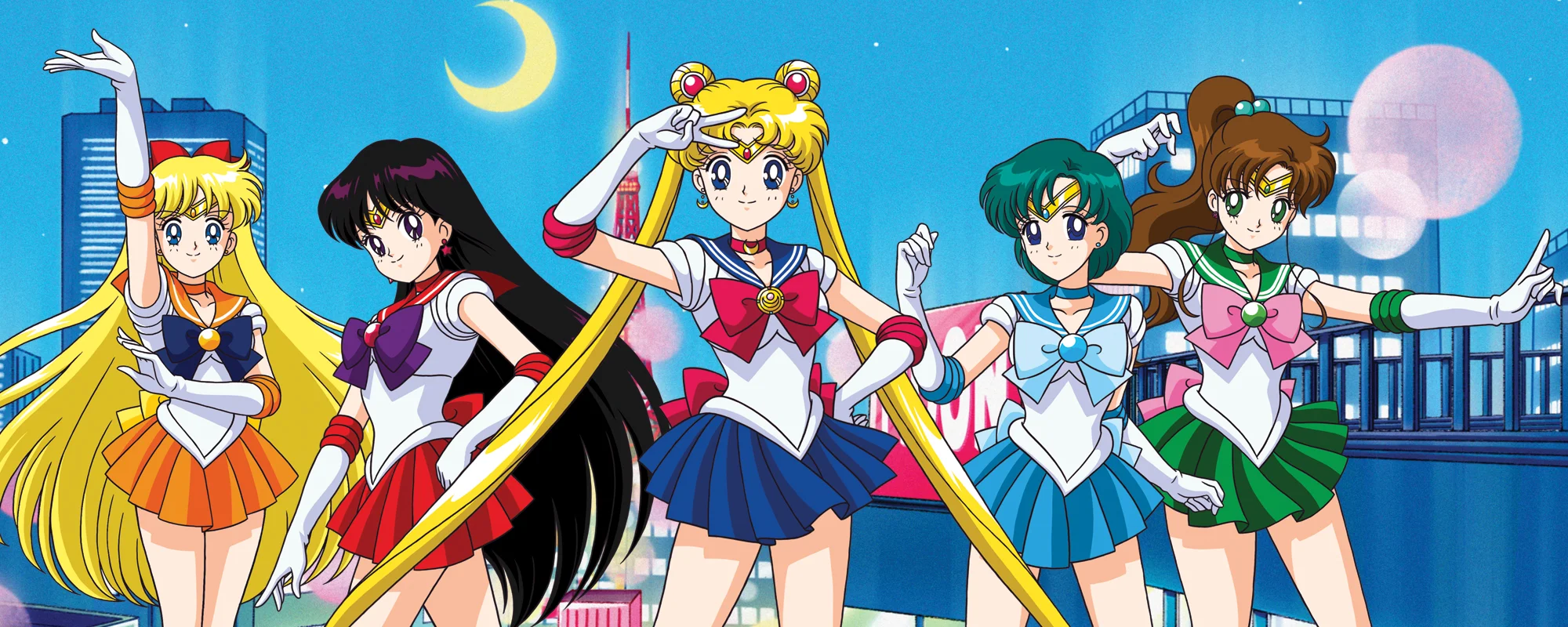
So you’ve tackled the look of the character and you know what it is that they accomplish on screen. How are they supposed to make the audience feel while watching them? Having an understanding of color theory and what is subconsciously associated with certain colors can help you establish a direction you want to move in when you reach this stage of the design process. What is super cool about character design is that color palettes can reflect their personality, goals, and role in the story. For example, Elsa, created by Disney for the movie Frozen, is known for her ice powers and empowering character arc. Her design features a beautiful blue dress and intricate braid in her hair, which reflect her regal and elegant personality. Equipped with a cold demeanor and likely depressed, her color palette reflects this distant relationship she has with the world through cool tones and darker colors. Whereas her sister Anna is optimistic, bright, endearing, and wants to embrace the world. She is often adorned with vibrant, saturated colors that make her reflect the warm personality she has.
Does your character stand out from the rest of the world or do they fall in line with the coordinated color palette the world seems to operate within?

Colors that draw the eye to the main character when in contrast to the surrounding environment is a great way to make a character stand out even without a lot of complex details in the design. Consider what you want your character to say without having to add it into the dialogue.
Another color-centric aspect of character design is how many colors you should be working with. A trusty guide is 60/30/10 for three, and 60/20/10/10 for four. I typically pick a main color that roughly occupies 60% of the design, 30% is the secondary color, and 10% is the third. This helps you draw attention to aspects of the character you want paid attention to. This ratio can be seen on Mickey Mouse with the proportions of black, white, red and yellow. Red draws the eye to him as a character and allows for most of his performance to focus on his expressions and animated performance rather than being bogged down by multiple colors no one will remember well-enough to list out.
Designing characters for animation requires special considerations. By understanding basic human construction, the task of transforming a character from one world to another is as easy as learning to stylize a human from realism to a style you fancy. At the end of the day, using a set of visual symbols that your audience can quickly recognize and interpret, makes your animation more efficient, dynamic, and effective. Being considerate with color and detail choices keeps audiences engaged and aware of subconscious details about the character they might not verbally announce. Using these three areas of focus to establish what is realistic to accomplish in your project will help you maintain a higher level of quality throughout the duration of your project; which will hopefully help your team morale, client satisfaction, and demonstrate your true skills in storytelling. So go forth, experiment, and have fun creating your own iconic characters!
__
Note From Tongal: This blog is part of a series of Tongal Community-written blog posts that were originally sourced in the Tongal Blog Open Call Project. The views and opinions expressed in this article are those of the author(s) and do not necessarily reflect the official policy or position of Tongal. Read more Tongal Community-written posts here!