

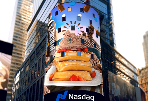
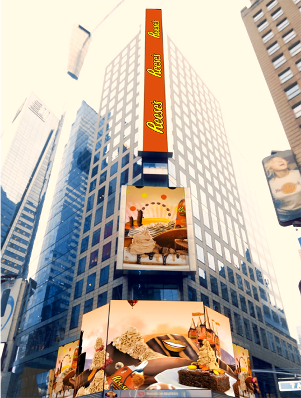
When it came time for Kraft Heinz to launch their new product, Hershey and Reese’s Whipped Toppings, they turned to the Tongal community to develop a 360° marketing campaign. Through a series of projects, Tongalers with wildly different skill sets - from animation/production house Pixeltown Arts, to copywriter David Kilgo, to artist Blake Wright, and food photographer Julie Lee - tackled various aspects of the campaign. With so many moving pieces, and most of the creators working remotely, the real challenge became making this campaign feel cohesive as it ran across social, in-store, and LED displays over Times Square.
Based on the concept Imagine the Dessertabilities, Kraft Heinz wanted every aspect of the campaign to transport their audience into a fantastical world of dessertabilities, a place where anything can be transformed into a sweet treat when topped with Hershey and Reese’s Whipped Topping. The result? A sprawling, whimsical world of rocket ships propelled by whipped topping, hot air balloons, and Reese’s Cup castles and carousels:
Due to the highly collaborative nature of this project, we decided to ask each creator a couple of questions to show how this all came together.
MM: Can you walk us through what it was like to design so many creative elements, bringing them together in a cohesive, visual spot? What aspects of the product inspired you?
Jimmy Ahlander (Pixeltown Arts): Absolutely! Kraft and the Tongal producer, Quaid Kocur, basically gave us a blank canvas which gives us a lot of room to be creative. I think the most inspirational aspect of the product is the fact that you can pair it with basically anything on the dessert table.That gave us a lot of possibilities in terms of designing elements and we could pick from a wide range of desserts. We tried to feature a variety of desserts, both obvious and unexpected, to really show the “dessertibilites.”
When designing the worlds, we took inspiration from a few different sources. We wanted to make something playful with the landscapes so we looked at Dr.Seuss’s dynamic and whimsical worlds. We also took inspiration from a pretty fantastic food artist named Carl Warner, who has done some very interesting work.
MM: What were some of the challenges of having to combine creative elements for two distinct candy brands (Hershey and Reese’s)?
Jimmy Ahlander: Combining the two products wasn’t a problem creatively. The brands have two distinct color schemes and we used the three main colors from each brand in the videos. The biggest challenge was a practical one. Since this video series included several deliverables, delivered in a relatively short amount of time, we had to think strategically. When we laid out the storyboard for each video, we reused and borrowed elements from the horizontal videos to the vertical ones in order to meet the deadline. The project was a beast in terms of elements that we needed to keep track of. Another challenge was not to eat all the desserts that was made for each shot.
MM: We know not all social videos play with sound, but the sound design on this project is fantastic! Can you talk about the concepting for sound design?
Jimmy Ahlander: Thank you! This is a music-driven video series so the track was of great importance. Our main goal was to find a special and quirky track that complemented the playful visuals. We ended up using four different tracks - a track for each brand, one for the world with the two brands combined and also a separate one for the Instagram series.
Regarding the sound design, we actually ended up cutting half of the sound effects from the videos and only kept the ones that was of importance to the visuals. We realized that a minimalistic sound design worked better. Our main challenge was how to include the “schhh” sound from the canister. We noticed pretty quickly that it sounded like we were sitting in an air vent if it was used for every dollop. We had to take it out and just use it in a few places.
MM: Capturing the tone and voice of a brand is never easy. What were some of the ways you worked to introduce this new product in a voice that felt authentic to both the brands - Hershey and Reese’s?
David Kilgo: Finding the right voice isn’t always easy, but doing a little research on each company is a great place to start. Reese’s and Hershey’s provided some creative briefs that really helped get the ball rolling. When writing actual copy, one trick that really works for me is to imagine it being read aloud by a character or just someone with a distinct personality/voice. This helps keep the tone consistent, as well as prevent the copy from sounding unnatural.
MM: Food Photography is such a specialized (and awesome!) field. When dealing with a brand new product, what are some of the considerations you have and prep/research you do? What were some fun, challenging things about this product?
Julie Lee: When I shoot a new product I do quite a bit of research and testing to understand how the product reacts to time, temperature, lighting, and other ingredients. Whipped products, in particular, are one of the more time- and temperature-sensitive products to capture; you have such a small window of time to get the perfect shot of the dollops before they start deflating. This product in particular oxidized over time, so that was another challenge. Our food stylist, Vivian Lui, determined the optimal number of times to gently shake the can of whipped topping to get the dollops just right!
MM: Wow, that’s very scientific! In order to make the product look as tasty as possible, what are some of the techniques you use?
Julie Lee: In order to make the Reese’s/Hershey Whipped Topping look as tasty as possible, we used a macro lens to capture the detailed ripples of the product and played with angles that would make the topping the hero of every shot and really look indulgent and delicious. When we were brainstorming food pairings, we leaned into complementary foods that give movement to a still image, like dripping chocolate and caramel sauces and sprinkles.
MM: What were some of the challenges of creating artwork that worked both in-store and on social? Blake Wright: This project was really streamlined and the client was excellent about communicating their vision up front, so honestly there weren’t any challenges to speak of. I wish most projects that come across my desk ran this comfortably!
MM: What was your creative process for creating artwork for a product that is brand new to market? What were your visual references and what elements about the product itself inspired you? Blake Wright: The client had their own pop art wallpaper vision for social, and I was comfortable and confident in helping them execute this idea. Obviously, I tried to keep things bold and flat in order to nod at pop art, and then simply repeating the patterns gave the illusion of a “wall paper print.” I was inspired by the product - a NEW take on “whipped cream topping” - was so innovative, fresh (and WILD!) that I thought it made it more conducive for out-of-the-box visuals. It’s easy to succeed when there ARE NO RULES! |
----
Do you have any tips for collaborating with team members remotely? If so, leave them in the comments below.